
Press Ctrl+ and K to search
请注意,本文编写于 710 天前,最后修改于 646 天前,其中某些信息可能已经过时。
目录
在 4.0 版本的 Ant Design Vue 中,提供了一套全新的定制主题方案。不同于 3.x 版本的 less 和 CSS 变量,有了 CSS-in-JS 的加持后,动态主题的能力也得到了加强,包括但不限于:
- 支持动态切换主题;
- 支持同时存在多个主题;
- 支持针对某个/某些组件修改主题变量;
- ...
通过ConfigProvider即可实时修改主题
vue<template>
  <a-config-provider
    :theme="{
      token: {
        colorPrimary: '#00b96b',
      },
    }"
  >
    <a-button />
  </a-config-provider>
</template>
在本项目中,我使用了antdv+pinia+sass的组合,理论上可以在任何前端项目中使用
通过改变页面中的自定义属性theme和dark配合sass+pinia实现实时修改主题色和亮暗模式
1. 对ant-design-vue主题定制
- 首先,准备好一个vue项目,配置好antdv
js"dependencies": {
  "ant-design-vue": "4.x",
  "pinia": "^2.1.6",
  "pinia-plugin-persistedstate": "^3.2.0",
  "vue": "^3.2.41"
},
"devDependencies": {
  "@vitejs/plugin-vue": "^4.2.3",
  "sass": "^1.64.2",
  "unplugin-vue-components": "^0.25.1",
  "vite": "^4.4.6"
}
- 创建一个store,命名为app.js,在里面写上下面的配置代码,颜色变量从scss文件中取得(自行搜索:如何在js中使用scss变量)
jsimport {defineStore} from 'pinia'
import {computed, ref} from 'vue'
import {theme} from 'ant-design-vue'
import variables from '@/styles/variables.module.scss'

/**
 * app 配置 开启持久化
 */
export const useAppStore = defineStore(
  'app',
  () => {
    const themeName = ref('red') // 主题名称
    const darkMode = ref('light') // 颜色模式
    const darkModeComp = computed(() => {
      document.documentElement.setAttribute('data-dark', darkMode.value)
      return darkMode.value
    })
    const themeConfig = computed(() => {
      document.documentElement.setAttribute('data-theme', themeName.value)
      // 主题配置
      return {
        token: {
          colorPrimary: variables[themeName.value] || '#27ba9b',
          colorSuccess: '#1dc779',
          colorWarning: '#ffb302',
          colorError: '#cf4444',
          colorInfo: variables[themeName.value] || '#27ba9b',
          wireframe: true
        },
        algorithm: darkMode.value === 'light' ? theme.defaultAlgorithm : theme.darkAlgorithm
      }
    })
    const setThemeName = value => {
      themeName.value = value
    }
    const toggleDarkMode = () => {
      darkMode.value = darkMode.value === 'light' ? 'dark' : 'light'
    }
    return {themeName, themeConfig, darkMode, darkModeComp, setThemeName, toggleDarkMode}
  },
  {
    persist: true // 开启持久化
  }
)
- 先写上一部分scss变量,文件命名为
variables.module.scss
scss$red: #F5222D;
$orange: #FA541C;
$yellow: #FAAD14;
$cyan: #13C2C2;
$green: #52C41A;
$blue: #2F54EB;
$purple: #722ED1;

:export {
  red: $red;
  orange: $orange;
  yellow: $yellow;
  cyan: $cyan;
  green: $green;
  blue: $blue;
  purple: $purple;
}
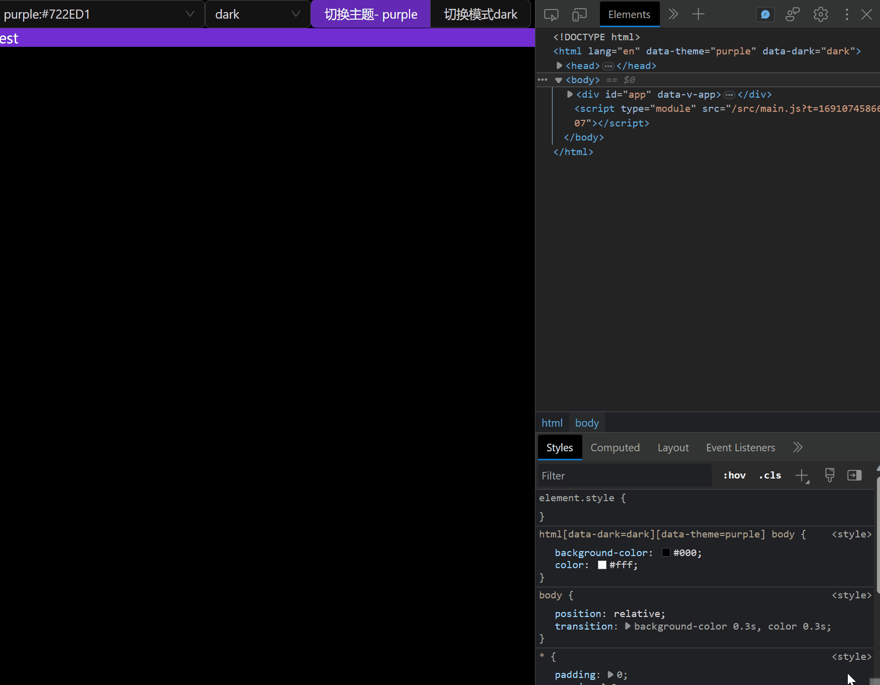
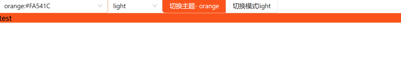
- 在App.vue中简单写点测试代码
vue<script setup>
import {useAppStore} from "@/stores/app.js"
import variables from '@/styles/variables.module.scss'

const app = useAppStore()
</script>

<template>
  <a-config-provider :theme="app.themeConfig">
    <a-select v-model:value="app.themeName" style="width: 240px">
      <a-select-option v-for="(color, name) in variables" :value="name"> {{ name }}:{{ color }}</a-select-option>
    </a-select>
    <a-select v-model:value="app.darkMode" style="width: 120px">
      <a-select-option value="dark">dark</a-select-option>
      <a-select-option value="light">light</a-select-option>
    </a-select>
    <a-button-group>
      <a-button type="primary">切换主题- {{ app.themeName }}</a-button>
      <a-button @click="app.toggleDarkMode">切换模式{{ app.darkModeComp }}</a-button>
    </a-button-group>
  </a-config-provider>
</template>

<style lang="scss" scoped>
</style>
- 便可以得到下面效果,这样完成了对ant-design-vue组件主题的自定义
2. 对自定义内容进行主题定制
上面使用的是js操作antdv中的主题,实际开发中,我们会有一部分组件是自己设计,因此为了维持主题的统一性,我们可以使用sass进行主题的定制
如何实现我们指定一个主题名称时,页面自动切换为指定的颜色组合呢
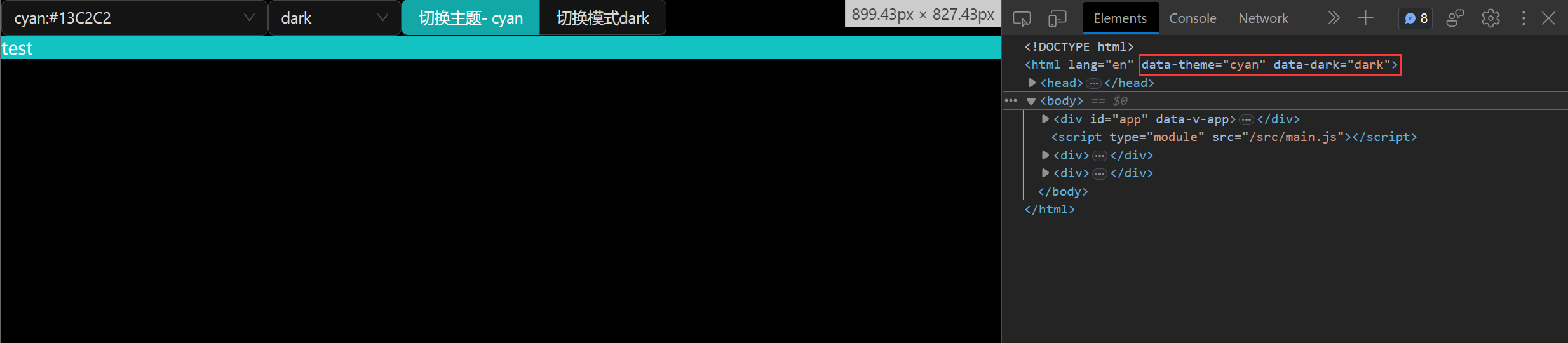
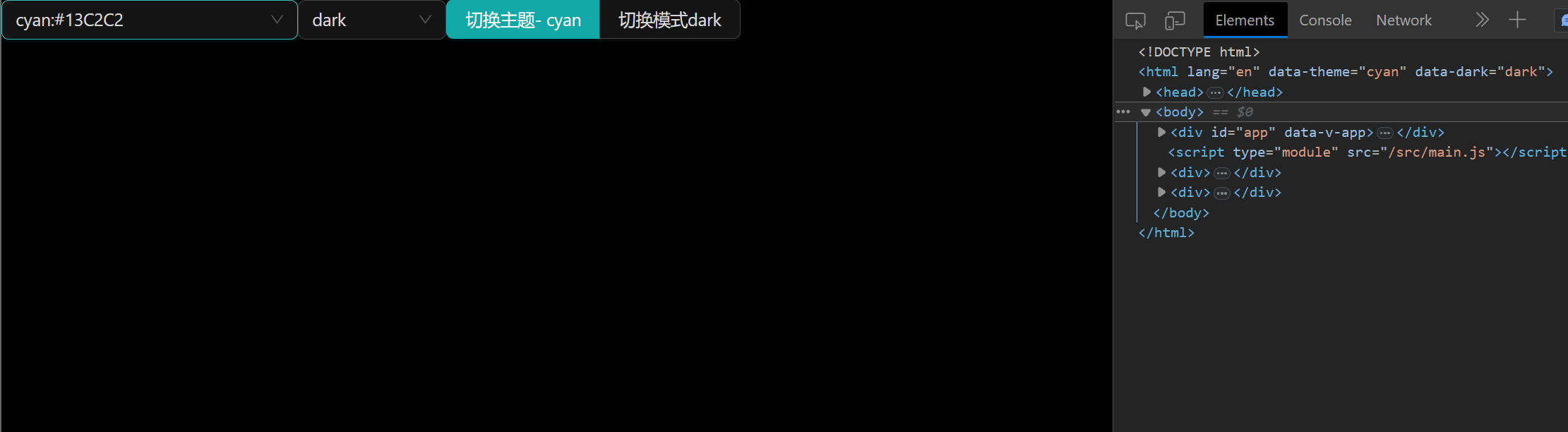
我们可以使用html的自定义属性来控制我们的主题
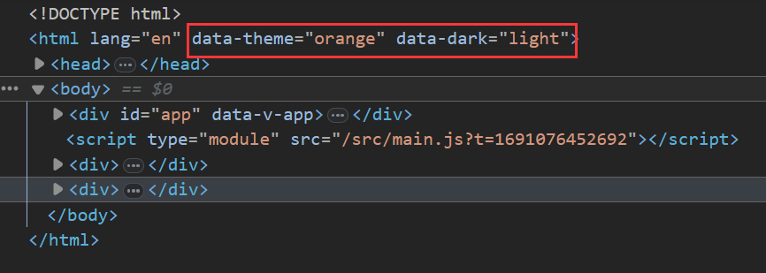
比如下面这段代码
scssbody {
  position: relative;
  transition: background-color 0.3s,
  color 0.3s;
  html[data-dark='light'][data-theme='red'] & {
    background-color: red;
    color: #000;
  }
}
当data-dark='light'和data-theme='red'同时成立时,背景颜色设置成红色
那如果我们需要设置多组主题和模式时,代码就会变成下面这个样子
scssbody {
  position: relative;
  transition: background-color 0.3s,
  color 0.3s;
  html[data-dark='light'][data-theme='red'] & {
    background-color: red;
    color: #000;
  }
  html[data-dark='light'][data-theme='orange'] & {
    background-color: orange;
    color: #000;
  }
  html[data-dark='light'][data-theme='yellow'] & {
    background-color: yellow;
    color: #000;
  }
  html[data-dark='light'][data-theme='cyan'] & {
    background-color: cyan;
    color: #000;
  }
  ...
}
因此,我们需要使用sass来帮我们减少重复的代码,使用@mixin和@each可以批量生成上面重复的片段
scss$modes: (
        light: (
                bgColor: #fff,
                infoColor: #000
        ),
        dark: (
                bgColor: #000,
                infoColor: #fff
        )
);

@mixin useTheme() {
  @each $key, $value in $modes {
    html[data-dark='#{$key}'] & {
      @content;
    }
  }
}
下面这段代码
scssbody {
  position: relative;
  transition: background-color 0.3s,
  color 0.3s;
  @include useTheme {
  }
}
相当于
scssbody {
  position: relative;
  transition: background-color 0.3s,
  color 0.3s;
  html[data-dark='light'] & {

  }
  html[data-dark='dark'] & {

  }
  ...
}
同样的,因为我们使用了主题色和亮暗模式的组合,所以也需要使用到两层@each循环遍历
scss@mixin useTheme() {
  @each $key1, $value1 in $modes {
    @each $key2, $value2 in $colors {
      html[data-dark='#{$key1}'][data-theme='#{$key2}'] & {
        @content;
      }
    }
  }
}
接下来,就是根据当前的主题和模式返回对应的颜色了,这里我们需要一个全局变量存储当前的颜色和模式
scss$curMode: light;
$curTheme: red;
@mixin useTheme() {
  @each $key1, $value1 in $modes {
    $curMode: $key1 !global;
    @each $key2, $value2 in $colors {
      $curTheme: $key2 !global;
      html[data-dark='#{$key1}'][data-theme='#{$key2}'] & {
        @content;
      }
    }
  }
}
并完成颜色的定义
scss$colors: (
        red: (
                primary: $red,
                info: $red,
        ),
        orange: (
                primary: $orange,
                info: $orange,
        ),
        yellow: (
                primary: $yellow,
                info: $yellow,
        ),
        cyan: (
                primary: $cyan,
                info: $cyan,
        ),
        green: (
                primary: $green,
                info: $green,
        ),
        blue: (
                primary: $blue,
                info: $blue,
        ),
        purple: (
                primary: $purple,
                info: $purple,
        )
);
然后,写一个根据$curMode和$curTheme返回对应值的函数
scss@function getModeVar($key) {
  $modeMap: map-get($modes, $curMode);
  @return map-get($modeMap, $key);
}

@function getColor($key) {
  $themeMap: map-get($colors, $curTheme);
  @return map-get($themeMap, $key);
}
然后在混合里面就可以使用函数获取当前主题或模式对应的颜色值了
scssbody {
  position: relative;
  transition: background-color 0.3s,
  color 0.3s;
  @include useTheme {
    background-color: getModeVar('bgColor');
    color: getModeVar('infoColor');
  }
}
使用theme.scss
scss<template>
	<div class="test">test</div>
</template>
<style lang="scss" scoped>
@import "@/styles/theme";

.test {
  @include useTheme {
    background: getColor('primary');
  }
}
</style>
如果对你有用的话,可以打赏哦
打赏


本文作者:peepdd864
本文链接:
版权声明:本博客所有文章除特别声明外,均采用 BY-NC-SA 许可协议。转载请注明出处!
目录